
Portfolio: Content Strategy. UX Writing.
Content Design.
Design & AI Tools
Figma, Adobe Creative Cloud, Miro, Invision
Microsoft 365, Google Suite (Docs, Sheets)
Workfront, Jira, Trello, Evernote, Airtable
WordPress, Squarespace, CMS
ChatGPT, Perplexity, Grammarly AI, Gemini
Slack, Teams, Zoom
Collaboration
Industries
E-commerce
Healthcare
Telecom
Tech
Games
Accounting
Legal
Tax
Sports
Entertainment
Clear. Concise. Consistent
“Craig, thank you for improving our user experience tremendously with your focus on copy across our services.”
- B. R., Executive Vice President, AT&T Mobility
Partnered with product, engineering, and design teams across time zones to establish scalable content processes, ensuring consistent experiences across platforms.
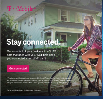
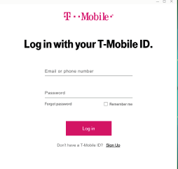
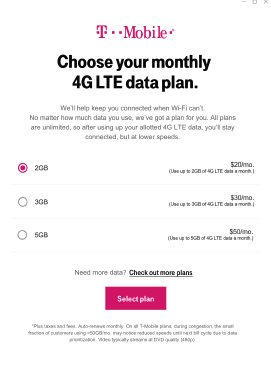
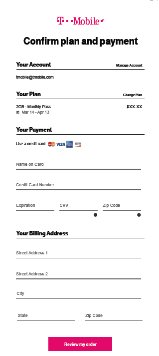
T-Mobile / User Experience Copy
PROJECT: eSIM AND TABLET PLAN PURCHASE FLOW
The problem: There was no way for tablet users to purchase eSIM plans for their devices.
Deliverables: All copy and content design work, and UX strategy with the design lead. The approvals stretched to more org leaders than normal project generally did.
The approach: Simplify the entire experience with a significant focus on trimming the copy and ensuring the visuals and the text complement each other.
Result: This was a big success from a design and UX standpoint. My goal was to use fewer words and more impact. there were more lessons to be learned when it comes to copy reviews, but it was a big success—with a long way to goy
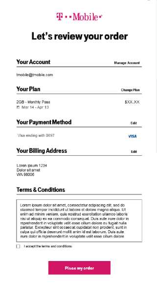
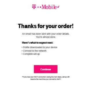
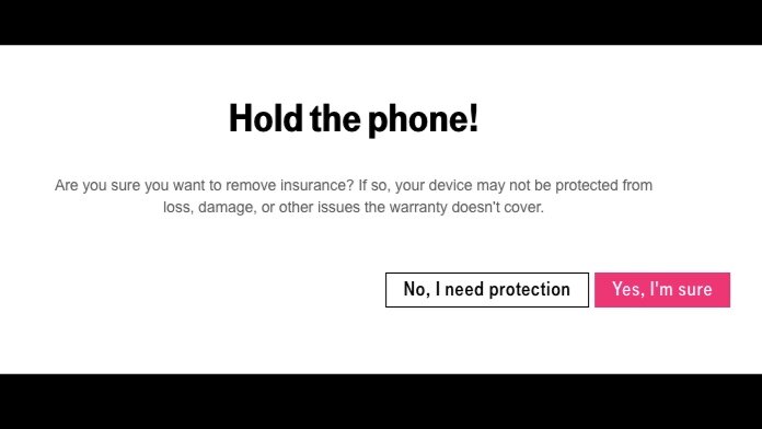
Project: Buy Flow with insurance
The problem: Customers were not getting through the digital purchase flow.
Deliverables: All copy and content design work, and the editorial strategy—especially the strategy around offering insurance.
The approach: Simplify the entire experience with a significant focus on trimming the copy and ensuring the visuals and the text complement each other.
Result: From a copy standpoint, my goal was to use fewer words and more impact. The customer base had a tough time getting through this flow, so by simplifying and creating more powerful copy that is glanceable and easy to understand, the KPIs increased, but with a long way to go.


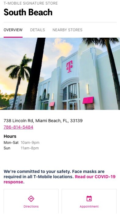
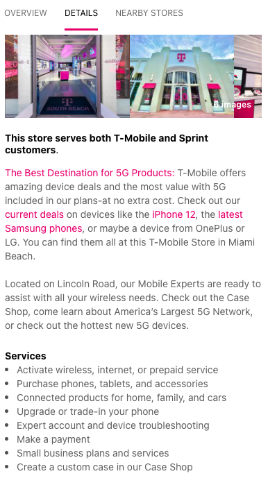
T-Mobile Signature Store PrograM
Signature Store project
The problem: Signature stores needed a more specific and powerful treatment in company search results compared to the regular stores. This project was primarily a brand play.
Deliverables: All copy and content design work, approved by leadership and legal.
The approach: Highlight the areas of the signature stores while visually creating excitement for the stores and the brand.
Result: Senior leadership was happy with our work, but I was disappointed with the last-minute changes by the product owner, which meant that the signature store results didn’t have the differentiation we hoped.


AT&T Entertainment / UX Copy Screens
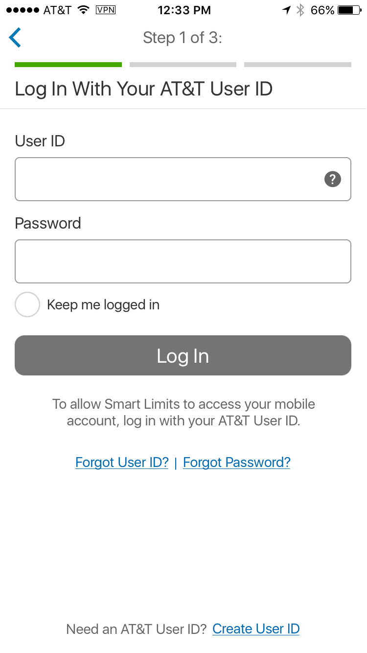
AT&T Call Protect
The problem: At the time, the CEO of AT&T and the telecommunications industry were being taken to task by Congress about runaway robocalls and spam to hundreds of millions of customers. The president of the United States tasked the AT&T CEO with fixing this problem, and "AT&T Protect" resulted from that request.
Deliverables: All UX content strategy, UX copy, and IA work with the design team. Approvals were needed up through the C-Suite level because this project was ordered by the White House of all telecom companies to stop robocalls.
The approach:
This high-visibility project had an extremely short timeframe and included daily interaction and collaboration with the vendor. The approach was to create an app that did the basics while keeping the design and copy clean and consistent. We didn't have the time or resources to put premium features in the first version.
Result: While the process was a bit hectic, we finished the app and got it in the App Store on time and under budget. As of a couple of years ago, the app had blocked over 2 billion spam calls.


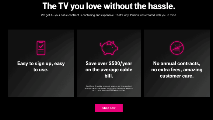
Streaming Service Copy: T-Vision
Backstory: It's not always the case, but UX was involved in this project from kick-off. The big concern was that the company had not created a TV application, and the ones in-market had proven confusing and challenging to set up.
The problem: Create a design for a new streaming service TV application. After only a short time in market, these apps generally have brutal setups.
The approach: The key was not to confuse people more than they already are with TV apps, as 90% of the TV apps in the market do currently. The content needed to be glanceable since most customers approach TV streaming app setup with glances and low confidence.
Result: This was a big success from a design and UX standpoint. Probably the best app that came out of the company that year, but like many streaming services, TVision was not destined to last.


Error messages
Error messages I have been confusing customers and members for decades. Microsoft was always the worst offender, having error messages that made no sense to anybody. When crafting an error message, keep in mind that it needs these three things:
1. Alert the user that an error has occurred
2. State the error (without jargon)
3. Explain how to fix the issue or the user's "next steps"
Also, you need to get inside the head of the customer when thinking about error messages. Their frame of mind will have changed if they've been stopped from reaching their goal.

Inline error messages


